
Overview
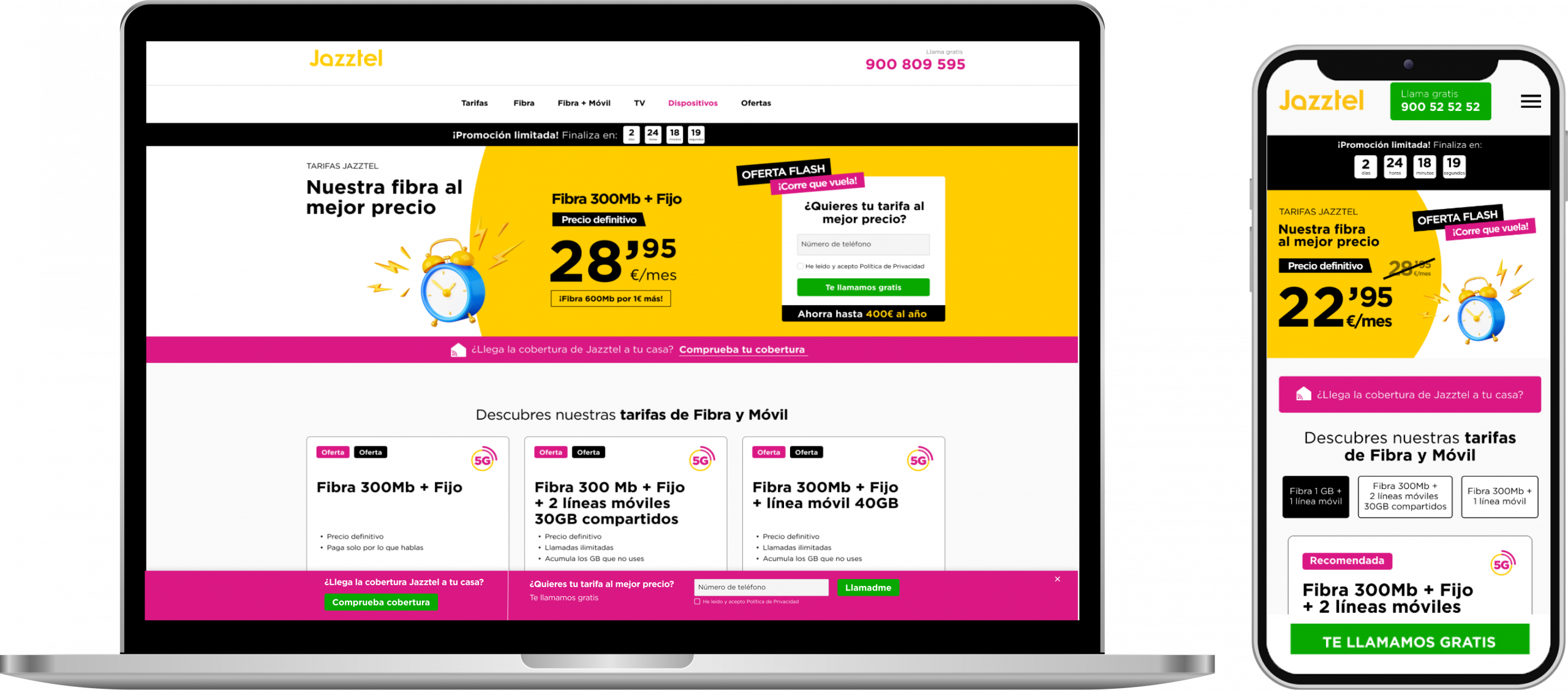
Jazztel is a global telecommunications operator that offers its users various internet services. The project is focused on lead generation and acquiring new customers who want to enjoy the products offered by the brand.
Company
ACCOM
My role
Product Designer
Timeline
1 month
Responsabilities
Market research, visual design, prototyping
Goal
Lead generation
Optimize the design to encourage more users to complete the form, with a clear, simple, and action-focused experience.
Sales conversion
Provide users with the right information so that when an agent contacts them, they’re more likely to move forward with the purchase.
This project is focused on the second fase of the funnel, the conversion.
Design decisions
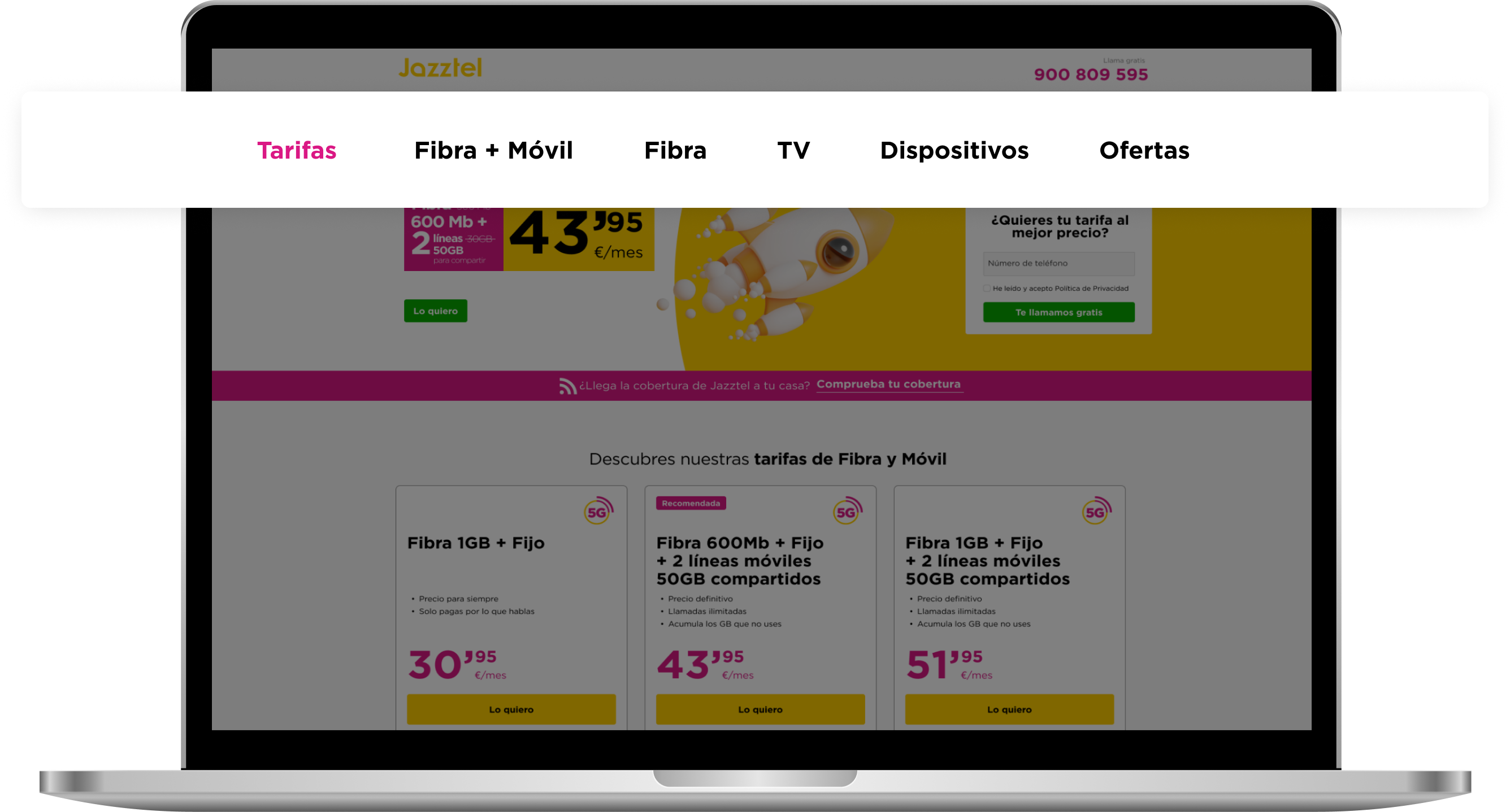
Offer segmentation in tabs
I reorganized the offers into segmented tabs to facilitate exploration and improve navigation. This structure, based on user behavior, allowed for better highlighting of relevant campaigns. The redesign increased interest and interaction, achieving a CTR of 8,31%.
CTR
8,31%
Content filtering
I implemented filters by device type to facilitate searching and highlight discounted products. This improvement personalized navigation and boosted campaign visibility. The mobile device filter generated the most interest among users, achieving a CTR of 9,94%.
CTR
9,94%
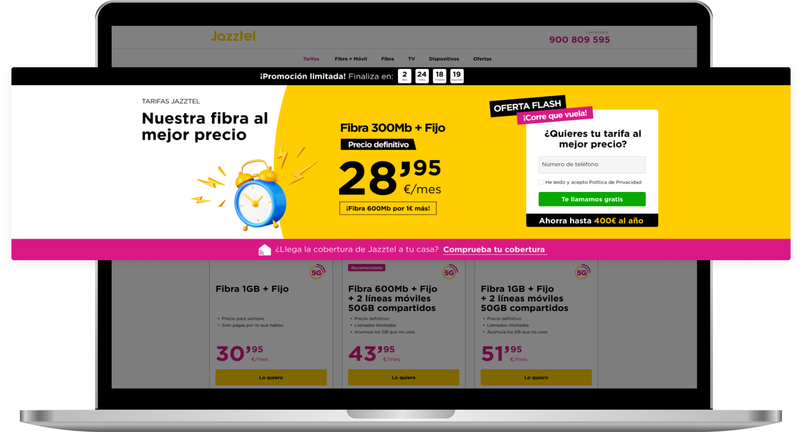
Anatomy of the banner
I designed the banner to show the most relevant information on the first scroll, following the natural flow of reading: featured offer, visual benefits, and clear call to action . Elements such as the timer and value messages helped capture attention. This structure contributed to achieving a CTR of 2,99%.
CTR
2,99%
Sticky component on desktop
I added a sticky component to the desktop to keep the CTAs with the highest conversion rates visible throughout the browsing experience. It appears after scrolling, accompanying the user and facilitating access to the form at any time . This solution helped maintain active conversion, achieving a CTR of 1,81%.
CTR
1,81%
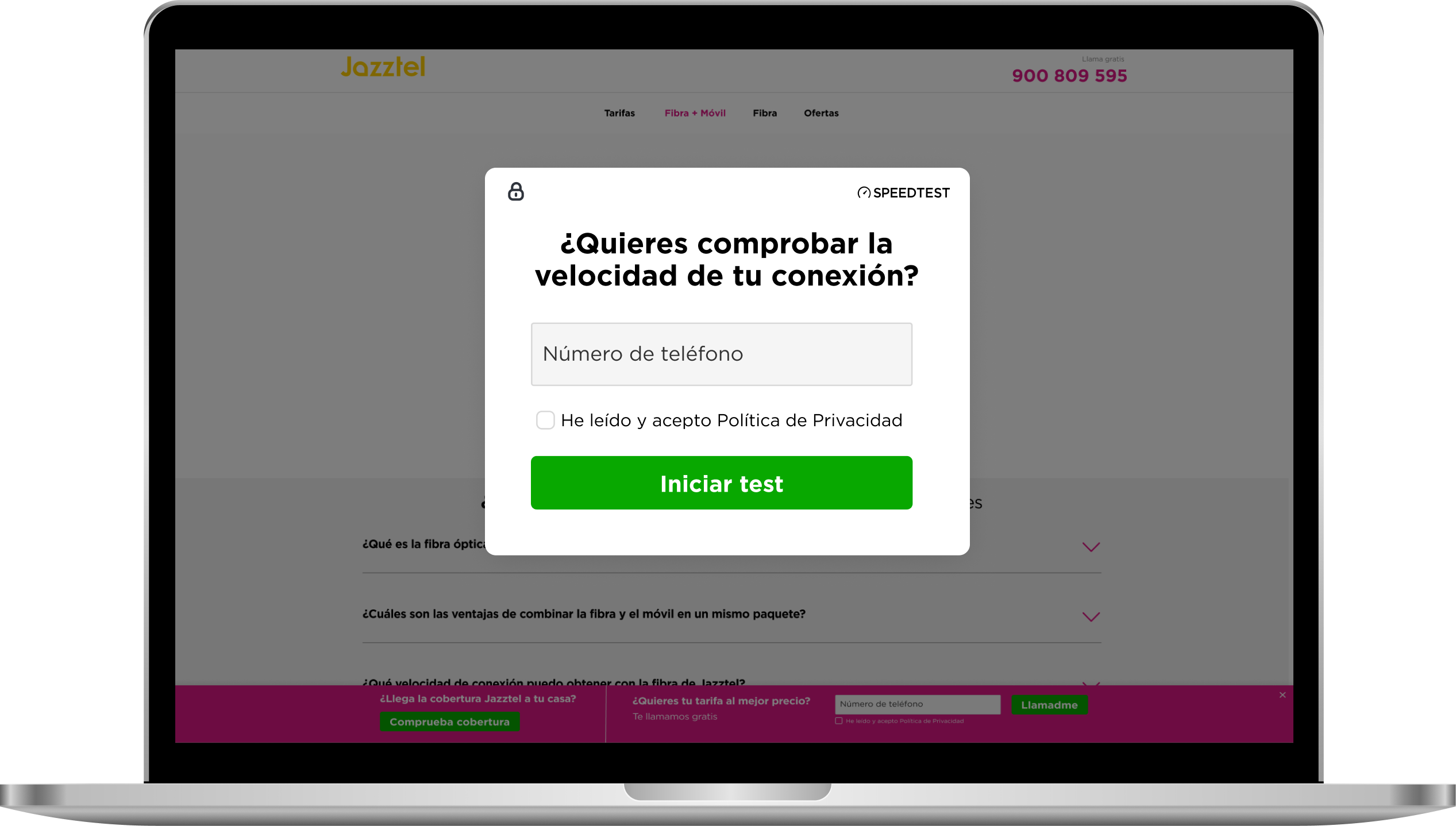
Speed test
The speed test is another method of lead generation, implemented as a block located at the end of the landing page. It offers users a functional tool, integrated via an API, to evaluate their current connection . To access the test, they must first complete a form, which allows us to secure the lead before offering the service. This solution closes the landing page with a useful resource and an additional lead capture channel, achieving a CTR of 1,08%.
CTR
1,08%
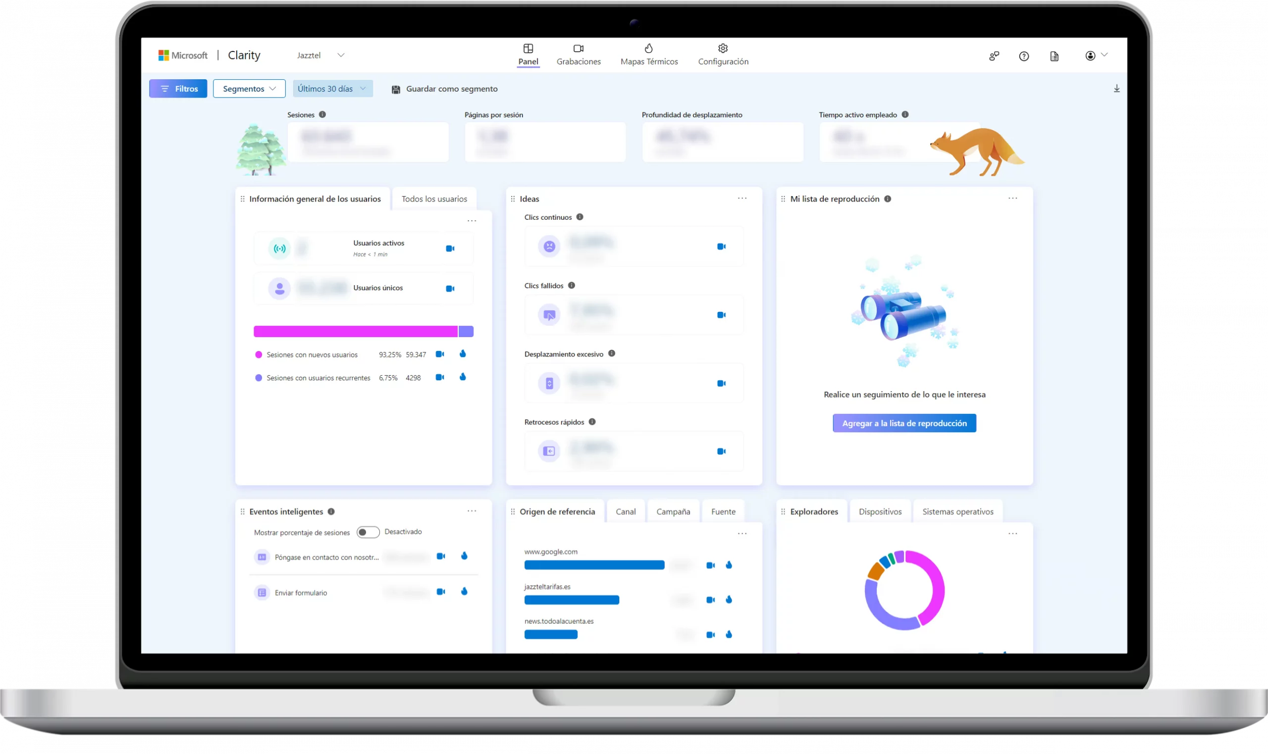
Data analysis
To visualize the evolution of design decisions, I used Clarity. This resource allowed me to synthesize relevant data in a centralized dashboard.
With Clarity, I was able to identify which pages generate the most impressions, assess the impact on users, analyze interaction sessions with specific website elements, and use heat maps to better understand user behavior.
In addition, Clarity has provided me with detailed information about the devices and browsers most used by users, allowing me to effectively optimize the user experience.
Impact
To showcase the impact of the implemented website improvements, we compared user, session, and lead data from one month before the enhancements to one month after. These metrics are particularly relevant for our campaigns as they measure the number of website sessions, accounting for multiple sessions by the same user, the number of unique individuals interacting with the website independently, and the users who provide their contact information, thus becoming leads.
+70%
User growth
+72%
Session growth
+53%
Leads growth
Design system
Colors
primary/yellow
secondary/magenta
Icons
Controls
buttons/standard
Cards
clients/offers


Learnings
This project has been a real challenge. In addition to tight deadlines, it was my first experience using the Figma tool. I had to structure the project to ensure its scalability and facilitate the reuse of components in the long term. It was also essential that the project be accessible, allowing the team to integrate and understand it without difficulty. The following are the most important aspects we worked on:
Improve Figma's technical skills
Follow up on launched projects
Analyze A/B testing
Create and maintain Design System
Create interactive prototypes

sandramv.com
Built and designed with a looooot of effort from Madrid ❤️