Movistar Plus+ is a streaming platform that works with every carrier. The main goal of this project was to improve the user experience through a redesign.
Company
Case study
My role
Product Designer
Timeline
2,5 months
Responsabilities
IA, redisign, prototyping
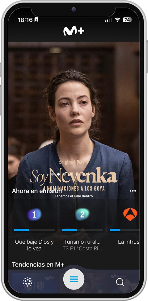
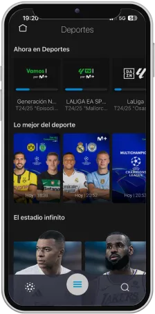
OLD DESIGN
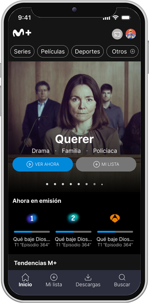
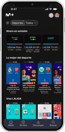
NEW DESIGN
Value prop
Quick access and seamless navigation
I redesigned the app’s structure to make it easier for users to access the content they care about, with smoother, clearer, and more continuous navigation.
Personalized experience
I worked on a more customizable interface, with improved filters, recommendations, and lists, so users feel in control of what they watch and perceive the platform as tailored to them.
Research & Analysis
User feedback analysis
To understand users’ problems and needs, I analyzed 2,748 reviews from the Google Play Store about Movistar Plus+, collected between February 10, 2024, and February 10, 2025.
The goal was to identify patterns in the user experience, so I first filtered the data by removing the company’s automated replies and irrelevant comments. Then, I grouped the reviews into key categories related to usability and design.
After filtering, 133 reviews remained that were directly related to user experience issues.
There are still some aspects related to the interface: it remains outdated and somewhat complicated compared to other platforms. Advertising can also be annoying at times; for users with the highest-tier subscription, there should be an option to skip it.
User 1
Focus on interface design
While you're watching live TV, it suddenly kicks you out and takes you back to the main menu. Please fix it as soon as possible — it's really annoying.
User 2
Focus on content discovery
Damage to the business
I used artificial intelligence to efficiently organize and analyze user comments . Through a pivot table, I identified the frequency of reported issues and grouped them into categories. This made it possible to define the most important user “jobs to be done” and prioritize improvements based on their impact.
This analysis laid the foundation for the redesign, ensuring that the solutions addressed real user needs.
Time optimization
85% faster with AI
Total manual time
13h
Total time with AI
3h
Design decisions
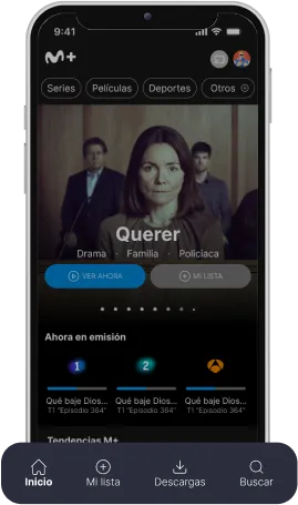
Home
Problem
Users are not able to access content quickly or find categories organized according to their interests. In addition, key functions like accessing the profile or casting content to another screen are not clearly visible. This creates friction in navigation and reduces the overall usability of the platform.
Solution
I added quick filters (series, movies, sports, others) to help users access content by interest.
I reorganized categories based on patterns from user reviews.
I placed profile access and cast-to-screen in the top right corner.
This improved both visibility and usability on the Home screen.
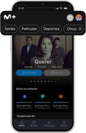
Quick filters
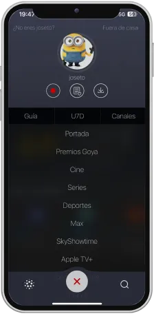
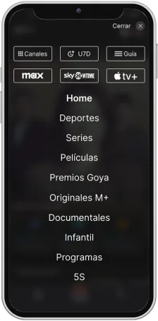
Problem
The menu lacked hierarchy and had small touch targets, making navigation confusing and error-prone. In quick filters, unrelated elements like profile access, filters, and navigation mixed together, increasing cognitive load and making interaction harder to understand.
Solution
The menu was redesigned with six quick-access options at the top for priority features. A bold visual indicator improves orientation, while larger typography and buttons expand touch areas, reducing errors and enhancing usability.
Search content
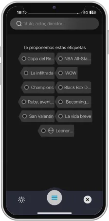
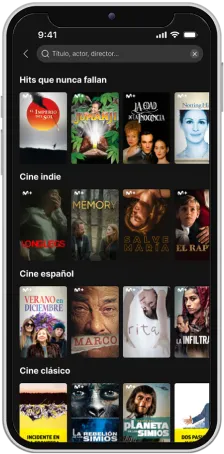
Problem
The search used generic, poorly designed tags with unreadable titles and no personalization, making content discovery difficult. The search bar was also hard to use, with basic actions like exiting or clearing text unnecessarily complicated.
Solution
Three clear search states were defined: zero data, suggestions, and results, streamlining the process. The initial state shows personalized categories in a carousel, while a redesigned search bar with a back arrow and “x” icon gives greater control and easier navigation.
Sports filter
Problem
Access to sports content lacked hierarchy and structure, creating confusion in navigation and making it difficult to filter by categories like football, tennis, or basketball.
Solution
A top navigation bar with sport-specific filters was added, letting users segment content quickly. Clear display of the current path and filter state improved orientation, while a redesigned search bar with back and “x” icons gave greater control and easier discovery.
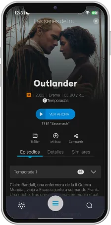
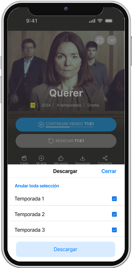
Content details (series example)
Problem
The content detail screen was cluttered and confusing, with poorly visible actions that made it hard to resume watching, identify seasons or episodes, and navigate options. Quick actions for personalizing or downloading content were also missing, reducing usability.
Solution
Key actions like Continue watching and Restart were prioritized for immediate access. A clearer layout separates details, episodes, and recommendations for intuitive navigation. New features, including a like button and season-based downloads, enhance personalization and functionality.
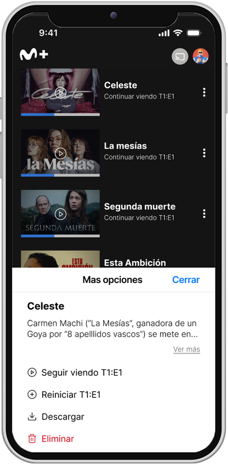
Navbar
Problem
The previous navbar was limited and not functional, lacking shortcuts to key sections like “My List” or “Downloads.” This madequick and personalized navigation difficult across the platform.
Solution
The navbar was redesigned with direct access to Home, My List, Downloads, and Search, giving immediate access to frequent sections. This update improves usability and enables faster, more intuitive navigation aligned with user habits.
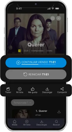
Extra solution
Native Modal improved navigation.
I introduced a contextual native modal that allows users to take action without leaving the screen. In series detail pages, they can quickly select seasons to download, while in content listings, extra options appear seamlessly via the three-dots menu. This reduces interruptions, speeds up tasks, and makes navigation more efficient.
Learnings
This project allowed me to truly understand the value of designing based on direct user feedback, after analyzing over 2,000 reviews collected from Google Play. This qualitative insight helped me identify the main pain points and propose solutions tailored to real user needs.
Additionally, I experienced the importance of integrating artificial intelligence tools into the analysis process, which enabled me to work more efficiently and accurately with large volumes of data — accelerating evidence-based design decisions.
...
Work in progres
It will be finished in a few weeks !
Want to see more?
Jazztel
Lead generation
Converse
Campaign targeting Gen Z
sandramv.com
Built and designed with a looooot of effort from Madrid ❤️